My Customizations, Etc. (circa 2001)
"No, I can't
just 'stick with the defaults', thank you"
My Computer
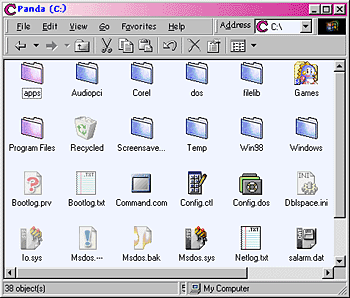
My computer doesn't look like your ordinary computer.
Look for yourself. I think you'll agree.

Notice how my folders aren't yellow? I actually
designed that folder icon myself. The other icons aren't exactly the defaults
either. C drive icon, no longer a grey rectangle. Now it's a distinctive
cue that it is the C drive. Custom icons for various file types, check.
Non-default fonts and color scheme, check.
Start Menu
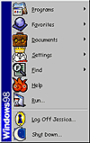
And look at my start menu. It just has so much
more personality than the default. King Dogbert for settings was only too
appropriate for the settings icon.

Web View Folders
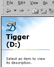
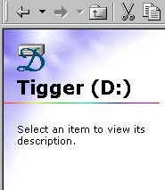
Before and after my custom artwork was added. You can
actually download my artwork here and create this customizations
yourself.


Folder Icon
So you might wonder, how did i design that folder icon
back in the my computer picture? It just takes a little creativity and artistic
sense. I had downloaded this folder icon  as part of a collection of imac themed icons. I also had this icon
  from a different set of icons I had downloaded. I wanted to use the imac one,
but it didn't match my web-view customized graphics, which had been color coordinated
to match the folder with the sun glare on it. But I wanted more. I wanted the
folder right aligned not left aligned, more like this copeland folder icon
  so it would match the other open folder icons that already come with windows,
and just for aesthetic reasons. So with a couple graphics programs, I changed
the imac folder to have the color palette of the folder with the glare, and flipped
it horizontally, all together creating this icon
  .
Pretty cool looking isn't it? Just one little problem. Windows uses two icon formats.
Big and small. Of my source icons only the copeland folder had a small icon view.
So I took the small copeland icon
  and changed the colors on it to look sorta like the large icon view, creating
this
  .
.
