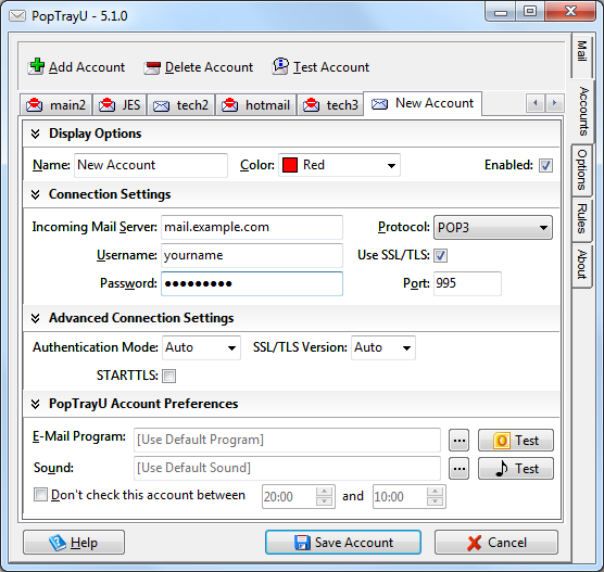
For the upcoming 5.1 release of PopTrayU, I’ve redesigned the accounts screen:
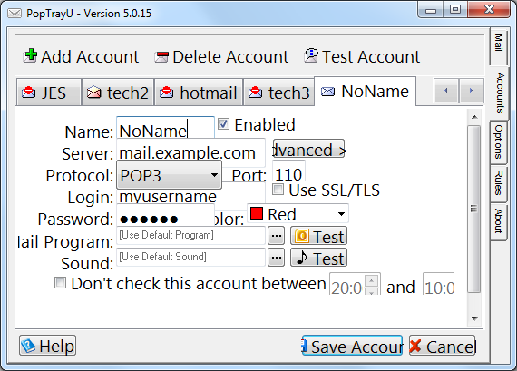
 In the old design, which was basically the PopTray 3.2 layout with new features squished in around the edges wherever they’d fit without changing things too much, things didn’t resize well. Look what happens if you increase the font size:
 Everything is overlapping, some of the captions don’t fit. It’s a bit…cluttered. And if you use a language other than English, the translations often had to be abbreviated to fit the space available.
The new design manually resizes and positions everything in both horizontal and vertical directions to accommodate the selected font size and language settings. The account settings are broken into logical groups, like splitting apart the server information for your server from the ways PopTrayU notifies you about, to make it the page easier to navigate. The sections are each collapsible as well, so the advanced options or notification options can be hidden if you don’t want to see those sections. Oh, and those buttons at the bottom? They are now intelligently sized…if the caption doesn’t fit, they will be resized larger to fit the caption. Users of languages other than English will also especially appreciate this new feature.
