I wanted to give you all a little preview of more of the new features I’ve been working on for the 5.1 version of PopTrayU.
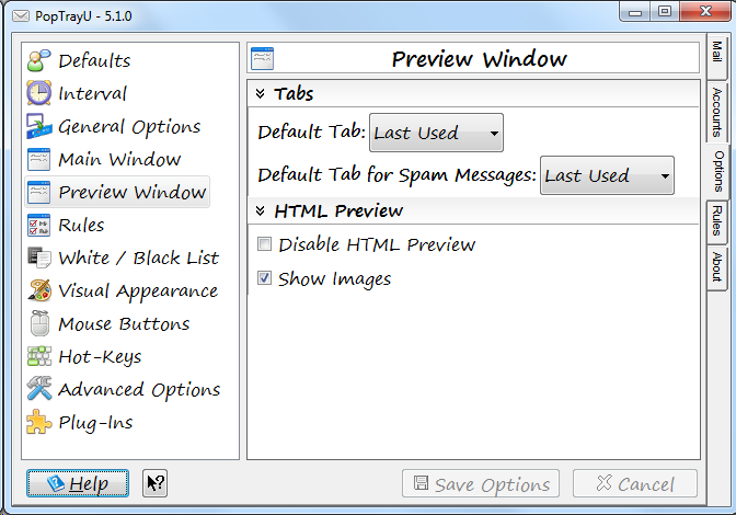
To start here’s a screen-shot of a new panel/category on the Options tab to customize the Preview Window:
 Lots of subtle differences. Before we get too far, I’m sure someone is thinking “What’s with the font?” No, 12 point Segoe Print is not a new default (it’s something I picked arbitrarily for testing). But it does illustrate a new feature–large fonts support. 12 point isn’t exactly “that large”, but it’s large enough that things would be overlapping and cut off, and created a horrible user experience for for users who use windows large fonts feature, or just wanted a larger font in this application.
I’ve painstakingly gone through just about every screen in the application and added resizing code to make just about every screen “resize correctly” in both the vertical and horizontal directions if you use larger fonts. As an added bonus, this actually improves the user experience for users of languages other than English as well, because buttons and label areas that used to be fixed size now will resize intelligently, and increase in size, if the translated caption doesn’t fit on default sized button. At first I tried to do this with a grid layout manager, because that would have been the elegant, clean way to do things, but after wrestling with some frustrating bugs in how it auto-sizes, it ended up being more reliable to just position everything manually. So it’s quite possible somewhere I overlooked *something*, but we’ll call that a bug for now, and feedback on resizing issues that need to be addressed will be welcome.
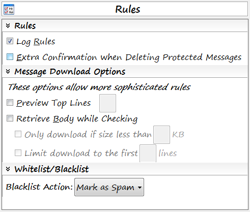
Now, let’s talk about the list of tabs. I gave a minor overhaul to the list of categories, and made some changes to the order of the categories. Defaults has been moved to the first category, because it holds the option to change the language. And as a french-speaking user pointed out, you need to change the language before you change any other setting on a new installation. Seems sensible, so language selection is now at the very top of the first options screen. There are also two entirely new categories of options: Preview Window, and Rules.
The Rules options category gathers together existing options relating to rules that were previously spread across several tabs. Options like whether to log rules, whether messages marked as protected by rules require an extra confirmation to delete, whether to download part or all of the message body to make more sophisticated rules, and what happens when you blacklist something are all gathered in one place under a single logical category.
 You may have also noticed that the old “Black List mark as Spam” checkbox has been replaced with the new “Blacklist Action” drop-down. I didn’t feel like it was intuitive what happens if you **don’t** mark blacklisted messages as spam–and the alternative involves things getting deleted. I take emails getting deleted seriously, and don’t want emails deleted because of bugs or because some configuration option was vague or unclear. So the drop down now forces an explicit choice between “Mark as Spam” or “Delete”. And I always do lots of extra testing (including on my own personal email) before releasing any changes that affect message deletion. I don’t want PopTrayU deleting your important mail–unless you really meant to do so.
The other new category in the list is Preview Window. There’s a couple of new features here, but previously, most of these options you had to change from a right-click menu on an actual preview window.
So, going back to that first screen-shot, you’ll see a new Tabs sub-category. This is for a new feature I’ve been wanting for some time. I’ve been torn over the design decision that PopTrayU should preview using the last selected tab or view type. I kept finding myself wanting PopTrayU to behave more like Outlook, where it automatically displays the email in HTML if the email has an HTML section, regardless of what view I was using to preview the previous email. But sine a lot of different people use PopTrayU in completely different ways to accomplish completely different goals, I didn’t want to eliminate the current option to have it display in the last used tab. So now you can choose between previewing with the last selected tab, or to always use a specific tab by default.
And, since Spam is sort of a special case, it gets its own independent selection. The main reason for this is that it’s likely that if you have images enabled, you may not want to display the email with images if it’s spam. So now you can choose whether you’d rather view spam as Plain Text, RAW headers, or any of the options supported for non-spam emails.
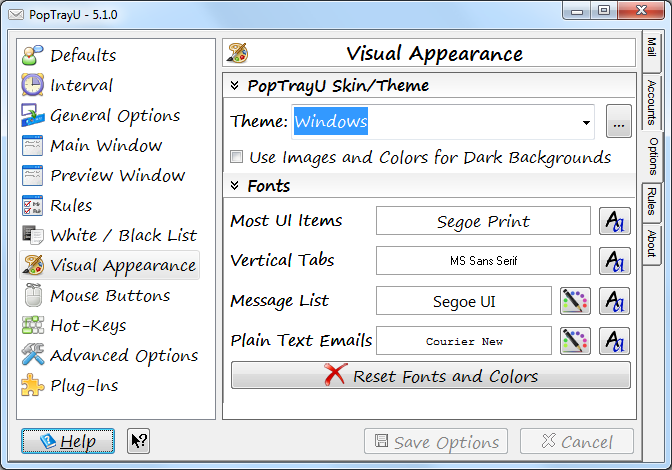
Back to the preview tab from the first screen shot. What can be customized for preview but isn’t on this tab? Fonts and Colors. When I first created this tab, initially I had put the options to customize the preview window font and colors (does not apply to HTML messages) on this new panel, however, I decided it would make more sense to have all of the font face, font size, and color customizations on the Visual appearance tab in one place.
 And while I was at it, I finally fixed that eyesore that was the fonts selection panel. Originally I’d had the colors for the message list as separate drop-downs, which minimized the number of mouse-clicks needed to customize everything. But I decided it was getting a little too cluttered, and confusing since only certain UI items can have the colors customized. I changed the previews to have borders–this was actually something I had wanted to do before, but there were some technical hurdles that required research to figure out how to make that happen.
