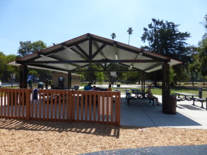
Sunridge Park is a fairly new park in the new development area near Grant Line Road and Douglas Blvd, so it’s fairly easy to get to from Folsom. The park is worth a visit, especially during the summer when the water features are turned on. It has a lot of universally accessible and unique features without being boring. There is something for everyone here, except perhaps copious amounts of shade, which is in large part because the park is so new that shade trees have not had time to mature.
Blog
McKinley Park in East Sacramento
McKinley park is in Sacramento, but it’s right off the freeway and such a cool park with unique play equipment making it worth the 25 minute drive. It’s convenient location just off the freeway also makes a great “stopping over” point to break up the drive to Ikea, the airport, or other out of town destinations. In the spring the trees overlooking the duck pond next to the playground are covered in beautiful pink blossoms.
For a long time McKinley park used to have quite a resemblance to Castle Park. Then in 2012, a third of the playground burned down due to arson. The community rallied support to rebuild the playground, and a year later, completely demoed the old playground and rebuilt it from the ground up with a huge volunteer labor force. The new playground still has a similar architecture, but built out of splinter-free synthetic materials that look (for the most part) like wood, featuring design elements suggested by the community, resulting in a very unique fun playground, up to date on all the latest safety and accessibility standards.
The play area overlooks a scenic duck pond. Signs say you aren’t supposed to feed the ducks though, as human food is basically junk food for ducks. The play area is fenced around all but the entrance/exit points, so kids are unlikely to accidentally run into the pond (though outside the play area on the walking trails, watch out for goose poop!). The turf in the play area is a mix of woodchips, with wheelchair/stroller friendly rubber turf trails running through the park.
The toddler play structure is closest to the entrance and has a train theme on the side of it, and has long ramps great for exploring. There are rockers ranging from single person rockers all the way up to a four-person spring-loaded teeter totter. The play structure was very engaging and my 2 year old was content to play there for quite some time before i tried to pry him away from that to explore the rest of the playground.
One of the play features that is perhaps most unique at this park is it has a large merry-go-round. Not quite the same as the ones I remember from childhood, but closer to it than any other playground I’ve yet been to in the area, it has room for quite a few kids at once and has spider-nets as well as individual spinning “cages” for passengers to ride on. It’s quite heavy to push, which makes it a little slower than the old fashioned kind (as I think it has to be to meet modern playground safety codes), but still completely delighted my kids, who had never seen more than a spinning seat play feature at other playgrounds.
There is also a sand-pit that is quite well-contained.
And an outer-space themed rock-climbing wall.
Big play structure, with ADA ramps affording my toddler easy access to the slides.
Toddler and Accessible Swings:
Picnic Area:
Location
601 Alhambra BlvdSacramento, CA 95816
Parking
The park does not have a dedicated parking lot. There is, however, free street parking all around the park. When we went, mid-morning on a weekday, we were able to park right out in front, but at busy times there may be more walking involved to get from parking spot to the play structure.
PopTrayU Bugtracker
Originally, for keeping track of issues with PopTrayU I attempted to use Sourceforge’s built in bug tracker. But, as I recall, I was less than enthralled with it for reasons I’ve long since forgotten.
![]() So then I started looking into other options, PHP based options I could run from the webhosting area on Sourceforge, and ended up selecting Mantis. I think I looked into bugzilla as well and I don’t remember what else. For the most part Mantis worked quite well, and had a slick-looking interface, and I loved the dashboard view where you could sort all the bugs by their status and it color-coded them in a way that just “made sense”.
So then I started looking into other options, PHP based options I could run from the webhosting area on Sourceforge, and ended up selecting Mantis. I think I looked into bugzilla as well and I don’t remember what else. For the most part Mantis worked quite well, and had a slick-looking interface, and I loved the dashboard view where you could sort all the bugs by their status and it color-coded them in a way that just “made sense”.
But Mantis and Sourceforge just don’t play well together. Every time you submit a change to a bug, the next page you try to load returns a 503 “Guru Meditation” error due to the Varnish Cache Server installed by Sourceforge. Apparently it’s some sort of timeout error, and I’d spent a lot of time looking into fixing the issue, possibly more than once, without success.
So what ends up happening in reality? It’s too much trouble to update the bug-tracker in everyday use So I just keep track of “active” bugs in a spiral notebook sitting on my desk with a pencil and only using the bug tracker only for keeping track of “things I might implement someday”.
So I decided to give this version tracking issue another look. Wanting to stay away from Soruceforge’s cache server issues, I started looking at the options for bug tracking used by some other open source projects I follow.
Google Code is deprecated and on the verge of being shut down and not open to new projects, so although I’ve liked them in the past that was out.
Microsoft’s CodePlex I love how they prominently display options to vote on your favorite bugs. Super-useful when you’re thinking “which bug should I tackle next”.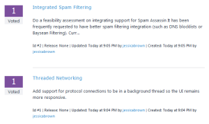 And it has a nice taxonomy for marking up the bugs–separate drop-downs for component, status, type, impact, etc for well-classified bugs. But it’s kind of boring and corporate, lacking color-coding, and the captcha nearly resulted in loss of data for both of the two first test entries I entered.
And then there’s the ever-popular GitHub. It’s bug tracker is simple–at times almost too simple. Component can’t be a separate field from the bug status–it’s all just a mashup of tags. I’d rather see the list of components in my project separate from the resolutions. But overall the bug tracker has some nice CSS and is quick and easy to add new bugs and update their status.
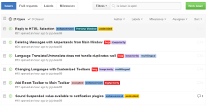 In the end I decided ease of entering and updating bugs was more essential than taxonomies and voting. If it’s not practically effortless to track the bugs, there’s a good chance I won’t use the bugtracker to keep track of features I’m considering developing.
So here’s the new bug tracker: https://github.com/jojobear99/PopTrayU/issues
Add/Remove Gmail Labels using Indy 10 in Delphi
According to support threads, Indy’s TIdImap4 supports fetching Gmail labels but doesn’t have support built in for adding and removing labels. I’m still working on figuring out how to fetch and read the fetched labels, but by using the SendCmd function to manually send the IMAP commands I got adding and removing labels working. So I thought I’d share that code:
function AddGmailLabelToMsgs(const uidList: TStrings; labelname : string) : boolean;
begin
  try
    if HasCapa('X-GM-EXT-1') and (uidList.Count > 0) and (labelname <> '') then begin
      IMAP.SendCmd(ImapCmdNum(),'UID STORE '+uidList.CommaText+' +X-GM-LABELS ("'+ labelname + '")',['OK','BAD','NO'], true);
      Result := IMAP.LastCmdResult.Code = 'OK';
    end else
      Result := false;
  except
    on E : Exception do
     begin
       //Dialogs.ShowMessage('Exception class name = '+E.ClassName);
       //Dialogs.ShowMessage('Exception message = '+E.Message);
       Result := false;
     end;
  end;
end;
At the heart of it, I am using Indy’s SendCmd function to manually send the command. It was a little tricky figuring out how to use this function since documentation and examples are a little scarce. The first parameter is a sequence number so that the response can be matched up with the command. Second is the remainder of the actual command. Third parameter is what responses to look for to know this command is “complete”, and the fourth is whether to look for a single line response or multi-line response.
I also have some commented out exception handling that was helpful to debugging when my SendCmd wasn’t formatted correctly, but is neither needed nor useful for production code.
Remove label is basically the same thing but with a minus sign:
function RemoveGmailLabelFromMsgs(const uidList: TStrings; labelname : string): boolean;
begin
  try
    if HasCapa('X-GM-EXT-1') and (uidList.Count >0) and (labelname <> '')  then begin
      IMAP.SendCmd(ImapCmdNum(),'UID STORE '+uidList.CommaText+' -X-GM-LABELS ("'+ labelname + '")',['OK','BAD','NO'], true);
      Result := IMAP.LastCmdResult.Code = 'OK';
    end else
      Result := false;
  except
    Result := false;
  end;
end;
And here’s the helper functions, minus the global/class/whatever variables:
ImapCmdNum() generates a sequence number for the IMAP transaction, essentially a replacement for NewCmdCounter in IdImap4, since it’s a protected property and client code can’t use it. At first I tried using “A1”, “A2”, etc. but it turned out that using a C prefix, “C1″, C2”, etc. like Indy was important for using Indy to process the response when I got into debugging why things weren’t working right at first…but now I’ve completely forgot exactly where it goes wrong if you don’t use a C.
function ImapCmdNum(): string;
begin
  Result := 'C'+IntToStr(cmdNum);
  inc(cmdNum)
end;
And HasCapa() is a function I added to make sure that the Gmail capabilities are actually available before trying to set/unset labels…Might not be totally necessary, but it seemed like a good idea. Under the hood, I just used Indy’s built in Capability function that calls CAPABILITY on the server, with a little caching so I wouldn’t need to do this more than once per session.
function TProtocolIMAP4.HasCapa(capability: string) : boolean;
begin
  if (capabilities.count = 0) then begin
    IMAP.Capability(capabilities);
  end;
  Result := (capabilities.IndexOf(capability)<>-1);
end;
Maidu Regional Park in Roseville
A few weeks ago, after a trip to the Douglas Blvd. Party City in Roseville to get some party supplies (that location is much larger than the one in Folsom) we decided to check out the nearby Maidu Regional Park, which is only a few blocks away. Maidu is the name of the native tribe that once lived in this area.
Maidu Park includes a Roseville branch library, community center, sports complex, skate park, and of course, a playground. This playground is definitely distinctive–it has an old western theme that is much more in depth than the Folsom City Lions Park as well as a lot of universally accessible features, as well as a couple not-so-universally-accessible features.
El Dorado Hills CSD Park
Our toddler playgroup went to CSD Park this week to check out the new rubber turf in the toddler play area. It’s really springy! But they did replace the sand play area with additional rubber turf. Apparently the sand required too much maintenance and was getting into too many places (like drains) that it shouldn’t.
This is a great first park for toddlers, especially with the large shade canopies and additional tree shade.
Toddler Play Area
B.T. Collins Park in Folsom
 BT Collins is pretty un-assuming from the street. It doesn’t have any shaded parking or even a dedicated parking lot. But it has a great amount of shade and is a tranquil oak-tree filled space once you walk up the small hill to the play structures (though if you forget something in the car and go back for it, the hill will suddenly seem a lot longer than it did the first time up…so check your diaper bag before you leave your car!). There are paved paths to the play structures for strollers. The toddler and big kid play structures are separated by more hillside, and if you keep hiking up the hillside from there you will find two hidden sand-volleyball courts just before the water tower and hiking trails.
Though the park is hilly overall, this park has a lot of space to run around without worrying about kids running in the street, and is surrounded by a lot of natural landscape that is hard to find in the middle of town available for public access (though watch out for rattlesnakes! they are native to Folsom). Continue reading B.T. Collins Park in Folsom
PopTrayU Progress: Unread Message Filtering
There was a user requested feature for PopTrayU to add filtering based on read/unread status. This is something that is only technically feasible for IMAP since POP servers don’t store read/unread status. Anyway, I started working on implementing this feature, and decided that if you are only showing unread messages, you might need a mechanism to change the read/unread status–especially if previewing automatically marks the message read on the server.
So whip up some code for this…go to test it…and…nothing. No change to the message status. Turn on some logging of server communication, and something looks off about the command set to the server…and the server response? Yeah, pretty sure that’s not what’s supposed to happen either.
Sent: C4 UID STORE 1264 (\Seen)<EOL>
Recv: C4 BAD Error in IMAP command UID STORE: Invalid STORE modifiers.<EOL>
This may not be so apparent in a non-monospaced font, but there’s a double space between 1264 and (\Seen) like a token got left out. But not being intimately aquainted with every nuance of the IMAP spec, I had to lookup the section on setting flags in the IMAP RFC for IMAP to be sure I even knew what the command was supposed to look like. It’s supposed to have a +FLAGS.SILENT in that missing token.
So, long story short, I had to update my copy of Indy from SVN to make sure the bug still existed on top of trunk, then I had to debug a variable type that disappeared in the new version of indy (it got replaced with something else), after retesting and trying a couple variants to see if it only exhibited this behavior when certain parameters were used, I filed a bug report to let the Indy team know about this issue, and left my code using a workaround with the better code commented out in the meantime. Remy and the Indy team are pretty responsive to fixing actual bugs, especially ones that are probably pretty trivial to fix like this (now incredibly useful but difficult to implement enhancements on the other hand, like IMAP IDLE I’m not about to hold my breath over…).
Aside from this particular sub-feature, there’s still quite a bit that needs to be done to make “unread only” mode happen. Like, the main window needs a whole new paradigm of basing the read/unread status off of the server for IMAP and off internal tracking for POP. And the message list needs to be using UIDs instead of relative message numbers for a bunch of different commands including but not limited to preview and delete.
And while I’m at changing it to download by UIDs, this would be a good time to evaluate whether it should be downloading only the “message envelope” (a limited set of headers that basically are the headers you see in your email client message list) instead of the “full headers” (including all the headers you usually don’t read like spam checker versions and hosts that redirected the email and so on that could be useful for rules) the way it does now. If you’re not making rules that use the extended headers, this could cut data transfer in about half, which could be a significant time saver on large inboxes, so it’s worth looking into, even though I’d probably still have to also support having the existing modes to support users who use those headers to create complex rules. And while I’m doing that…and so on and so forth it goes 😉
PopTrayU 5.1.0 Options Preview
I wanted to give you all a little preview of more of the new features I’ve been working on for the 5.1 version of PopTrayU.
To start here’s a screen-shot of a new panel/category on the Options tab to customize the Preview Window:
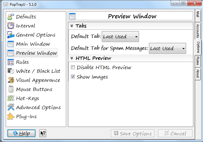 Lots of subtle differences. Before we get too far, I’m sure someone is thinking “What’s with the font?” No, 12 point Segoe Print is not a new default (it’s something I picked arbitrarily for testing). But it does illustrate a new feature–large fonts support. 12 point isn’t exactly “that large”, but it’s large enough that things would be overlapping and cut off, and created a horrible user experience for for users who use windows large fonts feature, or just wanted a larger font in this application.
I’ve painstakingly gone through just about every screen in the application and added resizing code to make just about every screen “resize correctly” in both the vertical and horizontal directions if you use larger fonts. As an added bonus, this actually improves the user experience for users of languages other than English as well, because buttons and label areas that used to be fixed size now will resize intelligently, and increase in size, if the translated caption doesn’t fit on default sized button. At first I tried to do this with a grid layout manager, because that would have been the elegant, clean way to do things, but after wrestling with some frustrating bugs in how it auto-sizes, it ended up being more reliable to just position everything manually. So it’s quite possible somewhere I overlooked *something*, but we’ll call that a bug for now, and feedback on resizing issues that need to be addressed will be welcome.
Now, let’s talk about the list of tabs. I gave a minor overhaul to the list of categories, and made some changes to the order of the categories. Defaults has been moved to the first category, because it holds the option to change the language. And as a french-speaking user pointed out, you need to change the language before you change any other setting on a new installation. Seems sensible, so language selection is now at the very top of the first options screen. There are also two entirely new categories of options: Preview Window, and Rules.
The Rules options category gathers together existing options relating to rules that were previously spread across several tabs. Options like whether to log rules, whether messages marked as protected by rules require an extra confirmation to delete, whether to download part or all of the message body to make more sophisticated rules, and what happens when you blacklist something are all gathered in one place under a single logical category.
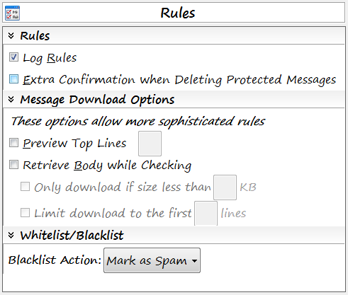 You may have also noticed that the old “Black List mark as Spam” checkbox has been replaced with the new “Blacklist Action” drop-down. I didn’t feel like it was intuitive what happens if you **don’t** mark blacklisted messages as spam–and the alternative involves things getting deleted. I take emails getting deleted seriously, and don’t want emails deleted because of bugs or because some configuration option was vague or unclear. So the drop down now forces an explicit choice between “Mark as Spam” or “Delete”. And I always do lots of extra testing (including on my own personal email) before releasing any changes that affect message deletion. I don’t want PopTrayU deleting your important mail–unless you really meant to do so.
The other new category in the list is Preview Window. There’s a couple of new features here, but previously, most of these options you had to change from a right-click menu on an actual preview window.
So, going back to that first screen-shot, you’ll see a new Tabs sub-category. This is for a new feature I’ve been wanting for some time. I’ve been torn over the design decision that PopTrayU should preview using the last selected tab or view type. I kept finding myself wanting PopTrayU to behave more like Outlook, where it automatically displays the email in HTML if the email has an HTML section, regardless of what view I was using to preview the previous email. But sine a lot of different people use PopTrayU in completely different ways to accomplish completely different goals, I didn’t want to eliminate the current option to have it display in the last used tab. So now you can choose between previewing with the last selected tab, or to always use a specific tab by default.
And, since Spam is sort of a special case, it gets its own independent selection. The main reason for this is that it’s likely that if you have images enabled, you may not want to display the email with images if it’s spam. So now you can choose whether you’d rather view spam as Plain Text, RAW headers, or any of the options supported for non-spam emails.
Back to the preview tab from the first screen shot. What can be customized for preview but isn’t on this tab? Fonts and Colors. When I first created this tab, initially I had put the options to customize the preview window font and colors (does not apply to HTML messages) on this new panel, however, I decided it would make more sense to have all of the font face, font size, and color customizations on the Visual appearance tab in one place.
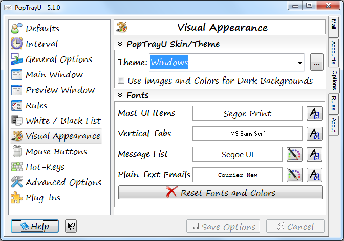 And while I was at it, I finally fixed that eyesore that was the fonts selection panel. Originally I’d had the colors for the message list as separate drop-downs, which minimized the number of mouse-clicks needed to customize everything. But I decided it was getting a little too cluttered, and confusing since only certain UI items can have the colors customized. I changed the previews to have borders–this was actually something I had wanted to do before, but there were some technical hurdles that required research to figure out how to make that happen.
Introducing the New Accounts Screen
For the upcoming 5.1 release of PopTrayU, I’ve redesigned the accounts screen:
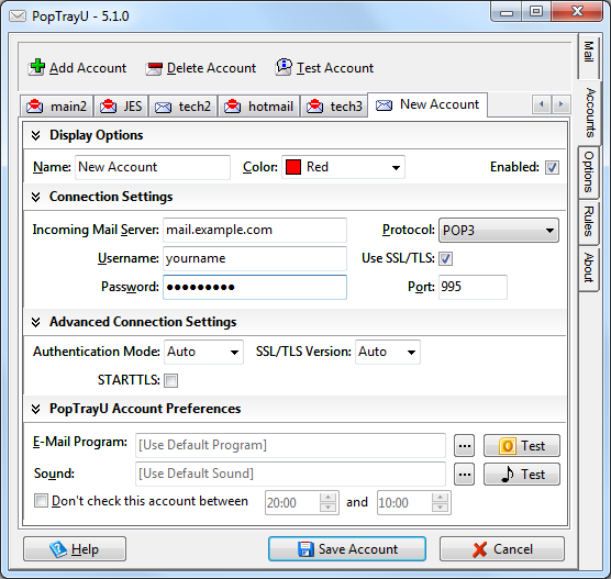 In the old design, which was basically the PopTray 3.2 layout with new features squished in around the edges wherever they’d fit without changing things too much, things didn’t resize well. Look what happens if you increase the font size:
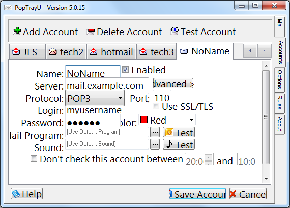 Everything is overlapping, some of the captions don’t fit. It’s a bit…cluttered. And if you use a language other than English, the translations often had to be abbreviated to fit the space available.
The new design manually resizes and positions everything in both horizontal and vertical directions to accommodate the selected font size and language settings. The account settings are broken into logical groups, like splitting apart the server information for your server from the ways PopTrayU notifies you about, to make it the page easier to navigate. The sections are each collapsible as well, so the advanced options or notification options can be hidden if you don’t want to see those sections. Oh, and those buttons at the bottom? They are now intelligently sized…if the caption doesn’t fit, they will be resized larger to fit the caption. Users of languages other than English will also especially appreciate this new feature.


