One of the many projects I’ve been up to lately is updating the website for the moms club I belong to. It probably doesn’t surprise you that that moms clubs are not typically havens full of geeks, so it probably also doesn’t surprise you that I got recruited into updating the website.
It’s something I don’t mind doing though, I think it will help other moms looking for their niche where they really find community. There’s a lot of stuff the club does that you wouldn’t realize from the website, and who’s going to pore over years worth of back-issues of newsletters (unless, say, one was updating a website and looking for content…) to learn about them?
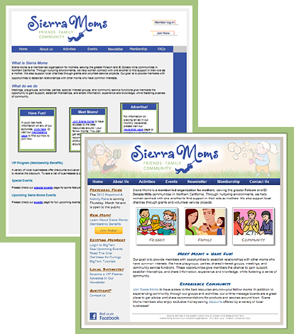
But before tackling content, the UI was in sore need of a makeover. Here’s a before/after thumbnail:
Certainly, there are still things I think could be better UI-wise, but its a huge improvement, and I’m going for incrementally better changes. By the time I got done with the new homepage, it had been so long since I’d gone back and looked at what I started with, that I’d almost forgotten some of the things I had fixed early on, like the random checkerboard pattern, and half of the headings being images without alt text, in a different color and font-style than the other headings on the page.
I’m going to have a featured article in next month’s member newsletter letting them know about some of the changes. Here’s an excerpt from my article:
Website Update
If you’ve been to our public website recently, you’ve probably noticed some changes. […]
Behind the scenes I’ve been working on sprucing up the website, doing lots of things that you probably haven’t noticed like search engine optimizations and new “404 error” pages, as well as some much more apparent changes like the new look for the home page and additional content throughout the site.
We now have a new contact form where you can easily contact a variety of club officers without having to keep track of who is fulfilling that role at the moment.
There is also a new playgrounds and outings guide that I’m particularly excited about. I’m always looking for ideas on fun things to get out and do, and being new to the area, I don’t automatically “just know” everything there is to do around here, so it was a great discovery to find a list of local attractions collecting dust in the files area. The list has been updated and now is on the website where you can easily share it with your friends, including ones who aren’t members—yet!
Another new addition to the website is a section with visual tutorials on how to use BigTent. To be honest, even I, a total geek who “should” know how to do that kind of stuff, had to search the help area to figure out how to leave a subgroup, so if there’s something that seems like it ought to be easy to do, but isn’t obvious, it’s probably not just you! So I’ve taken some of Ivette’s wonderful BigTent tutorials and added screen-shots and put them on the public website where they should be easy to find, and added direct links to some of the other existing tutorials. Same content, now easier to find.
There are still many more changes in the pipeline, so check back from time to time to see what’s new! And feel free to use the new contact form to send in your comments and suggestions on how we could make the website even more awesome!
Aside from the stuff mentioned in that article, other changes included things like a password protected file upload form with PHP script to let the member discount coordinator update the member discount PDF without me having to upload it and re-link it for her every time (FTP + non-techy = just not going to happen).
I also made “user friendly” 404 pages (and 401, 500, etc), that clearly let you know the page wasn’t found, but still has the navigation available to get back into the rest of the site even if you hit an unexpectedly bad link.
I also updated the entire site’s URL structure to make the URLs more logical. Having a folder called /pages/ in the url is kind of useless information to the person viewing the site. So the new urls follow a hierarchical structure and use folder names instead of filenames (so they don’t have to worry about whether it’s .php or .html), and of course I set up all the redirects in apache so incoming links from search engines don’t break and we don’t lose the page-ranks. And added the right meta-tags to make the snippets shown on google be the important part of the page, so the stuff shown is a bit more meaningful to people searching for the page, etc.


