How to use the Basic Primitives Org Chart Tool

As I mentioned in my previous post, Basic Primitives is a powerful tool for making Org Charts for your website. I thought it would be useful to document a little bit how to use the Basic Primitives Org Chart tool, because the examples weren’t quite the tutorial I was hoping to find.

So, starting with a simple example of something I needed for my project, I wanted to change the chart’s orientation from top to bottom to left to right. I started by searching the reference guide for orientation. I found it was a part of the primitives.orgdiagram.Config class.

So far, not much on how to use it though. Clicking on orientation type takes you to a more detailed explanation:

Disappointingly, that’s a pretty terse explanation. Ideally, it would explain all the different choices, where to set this property, and have a code snippet to show you the synax. Some defaults in this document are linked to their choices. This one is not.

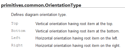
Searching the page for OrientationType does yield promising results for what the possible values are at least:

The best looking match is:

There’s also a close sounding match “primitives.text.TextOrientationType” however, the descriptions reveal that option is for changing the orientation of the text, not the chart.

So, now, how to use the information we’ve found from the reference guide?

If you go to the “How to Use” section, there’s a list of examples. You could really start with any of them, but I’ll pick the “First organizational chart”. On the plus sides, these examples are all editable, so you can experiment. On the down side, if you make a syntax mistake, the whole chart disappears and it doesn’t tell you where your mistake is.

So the important parts here are where the global options variable is initialized, and where they use it.

Initialization:

var options = new primitives.orgdiagram.Config();

this is given in the example. You’ll notice the variable options is of the type primitives.orgdiagram.Config, like we saw in the reference guide above. So this variable is the one you need to use to change any *global* configuration item that is in that same section of the reference guide.

Now skip down near the end of the example:

options.rootItem = rootItem;
options.hasSelectorCheckbox = primitives.common.Enabled.True;

These two lines change a couple of the global configuration options. So, to add another global option, you just need to add another line of code before or after these two lines, adding your new option.

Go back to the beginning of the reference guide, jump to the section on primatives.orgdiagram.config again, everything under the word “properties” here is a property of options that can be set:

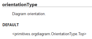
The correct value to use is a little trickier in this particular case. The documentation showed an example of the default being primitives.orgdiagram.OrientationType.Top, however, the documentation shows the possible values for Orientation under a heading called primitives.common.OrientationType. Notice anything different about the package naming? Yeah, that’s a little confusing, and I ended up with a blank diagram a couple times because of this.

Looking at the source code for the enumeration, it appears to be a simple documentation error, that the comment was not updated when the package name was changed for whatever reasons. Here’s the definition in the source code:

/*
Enum: primitives.common.OrientationType
Defines diagram orientation type.

Top - Vertical orientation having root item at the top.
Bottom - Vertical orientation having root item at the bottom.
Left - Horizontal orientation having root item on the left.
Right - Horizontal orientation having root item on the right.
*/
primitives.orgdiagram.OrientationType =
{
Top: 0,
Bottom: 1,
Left: 2,
Right: 3
};

Yep, I’m sure you’ve all seen code like that before. Anyway, just use OrientationType defined in orgdiagram, because that’s what the code says, and what works. And if you find some other property you want to set, and it’s not working, check the package name in the source code to make sure it’s right.

So our working line of code to change the orientation becomes:

options.orientationType = primitives.orgdiagram.OrientationType.Left;

And you just have to put that with the other global options (technically, other places are ok too, but to keep things simple, leave all the options in one place.

If you go back to the orgdiagram.global properties list at the beginning of the documenation,

(there’s more than fit in this screenshot), any of these are set following the same formula. Orientation Type is not the only enumeration incorrectly documented. graphicsType isn’t defined in the documenation at all. Just search the source code for the possible enumeration values. Theres no apparent consistency about whether things are under common or orgdiagam, so just look up what’s in which spot, unless you start to notice a pattern I missed.

options.graphicsType = primitives.common.GraphicsType.Canvas;
options.pageFitMode = primitives.orgdiagram.PageFitMode.PageHeight;

and so forth.

A couple of other options I ended up changing for my diagram included:

options.connectorType = primitives.orgdiagram.ConnectorType.Squared;
options.hasSelectorCheckbox = primitives.common.Enabled.False;
options.minimalVisibility = primitives.orgdiagram.Visibility.Normal;

As a footnote, changing the template around, because we didn’t need pictures next to the roles (since we only showed names for board members on our chart) was a bit more complex and requires structural changes to the javascript. I wouldn’t recommend it for javascript/jquery beginners unless the demo one is really close to what you need. But if you’re a seasoned user of javascript, it’s quite doable.

In Search of An Org Chart

Another project I’ve been working on recently was an online org chart to show the leadership structure for my mom’s club. One of the leaders sent me a powerpoint version of the chart and said “we want this on the website”.

I was anticipating this document would change over time, as new roles are created or subdivided and old roles are retired, so I wanted to make the update process straightforward and quick, so I wasn’t too keen on using an image for the chart.

My first thought was to use Google Orgchart, as it’s super-easy to set up, and I could have the whole thing done in five minutes or so, and there initially appeared to be a section on customizations. But then when I started digging into the options, it turns out there’s no option to change the orientation to go left to right instead of top to bottom, which ended up being a deal-breaker. To illustrate why, here’s a demo of what Google Orgchart’s output looks like with a shallow but wide tree:

In reality, there are 2-5 coordinators under each director role, and a few of those have as many as 3 assisting roles beneath that, so the actual chart would have been much wider. I just wanted to show you how having horizontal labels on a wide chart without putting children far enough down to scrunch the previous level results in a hard to read chart. For a deep hierarchy with few nodes, Google Orgchart seems like a great simple tool, but for a shallow hierarchy with many nodes per level, it just wasn’t the right tool.

So I started looking into alternatives to Google Orgchart. There was absolutely nothing with the same level of simplicity. At one point I even looked into how hard would it be to just export the powerpoint chart to HTML. Oh, but it turns out Office took “export to html” out of the features list in Office 2010, so I would have had to reinstall Office 2003, or experiment with a rather complex workaround, just to evaluate whether that would be a feasible choice.

In the end I kept coming back to suggestions that Basic Primitives looked like the right tool for the job. It’s demos clearly showed it was capable of a horizontal layout, but unfortunately, their “how to use” section completely neglected to give a demo on how to change that option. The tool provides lengthy documentation on all the properties you could possibly set, however, the “reference guide” looked like a machine-generated documentation, and I felt like the “how to” section could have been a little more helpful at explaining how to use the different customization options, rather than leaving that as an exercise to the newbie who has no idea how to use this tool.

It took a a bit of time studying the examples they did provide, and trying to match up how they changed this and that to where in the reference guide that item was documented to figure out how to decipher the reference guide. But in the end, I was successful in creating the org chart I needed using this tool.

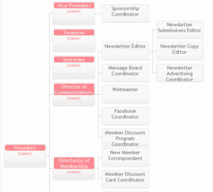
Here’s an image of what the layout ended up looking like using the basic primitives tool with custom (simplified) layouts for each role. The colors are designed to coordinate with the site ;-).

In my next post I’ll spell out a little more about how to use Basic Primitives because it’s a great tool, but the documentation isn’t very newbie friendly.

Moms Club Website

One of the many projects I’ve been up to lately is updating the website for the moms club I belong to. It probably doesn’t surprise you that that moms clubs are not typically havens full of geeks, so it probably also doesn’t surprise you that I got recruited into updating the website.

It’s something I don’t mind doing though, I think it will help other moms looking for their niche where they really find community. There’s a lot of stuff the club does that you wouldn’t realize from the website, and who’s going to pore over years worth of back-issues of newsletters (unless, say, one was updating a website and looking for content…) to learn about them?

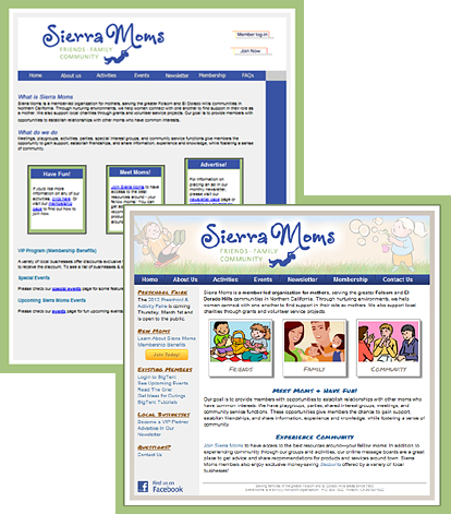
But before tackling content, the UI was in sore need of a makeover. Here’s a before/after thumbnail:

Certainly, there are still things I think could be better UI-wise, but its a huge improvement, and I’m going for incrementally better changes. By the time I got done with the new homepage, it had been so long since I’d gone back and looked at what I started with, that I’d almost forgotten some of the things I had fixed early on, like the random checkerboard pattern, and half of the headings being images without alt text, in a different color and font-style than the other headings on the page.

I’m going to have a featured article in next month’s member newsletter letting them know about some of the changes. Here’s an excerpt from my article:

Website Update

If you’ve been to our public website recently, you’ve probably noticed some changes. […]

Behind the scenes I’ve been working on sprucing up the website, doing lots of things that you probably haven’t noticed like search engine optimizations and new “404 error” pages, as well as some much more apparent changes like the new look for the home page and additional content throughout the site.

We now have a new contact form where you can easily contact a variety of club officers without having to keep track of who is fulfilling that role at the moment.

There is also a new playgrounds and outings guide that I’m particularly excited about. I’m always looking for ideas on fun things to get out and do, and being new to the area, I don’t automatically “just know” everything there is to do around here, so it was a great discovery to find a list of local attractions collecting dust in the files area. The list has been updated and now is on the website where you can easily share it with your friends, including ones who aren’t members—yet!

Another new addition to the website is a section with visual tutorials on how to use BigTent. To be honest, even I, a total geek who “should” know how to do that kind of stuff, had to search the help area to figure out how to leave a subgroup, so if there’s something that seems like it ought to be easy to do, but isn’t obvious, it’s probably not just you! So I’ve taken some of Ivette’s wonderful BigTent tutorials and added screen-shots and put them on the public website where they should be easy to find, and added direct links to some of the other existing tutorials. Same content, now easier to find.

There are still many more changes in the pipeline, so check back from time to time to see what’s new! And feel free to use the new contact form to send in your comments and suggestions on how we could make the website even more awesome!

Aside from the stuff mentioned in that article, other changes included things like a password protected file upload form with PHP script to let the member discount coordinator update the member discount PDF without me having to upload it and re-link it for her every time (FTP + non-techy = just not going to happen).

I also made “user friendly” 404 pages (and 401, 500, etc), that clearly let you know the page wasn’t found, but still has the navigation available to get back into the rest of the site even if you hit an unexpectedly bad link.

I also updated the entire site’s URL structure to make the URLs more logical. Having a folder called /pages/ in the url is kind of useless information to the person viewing the site. So the new urls follow a hierarchical structure and use folder names instead of filenames (so they don’t have to worry about whether it’s .php or .html), and of course I set up all the redirects in apache so incoming links from search engines don’t break and we don’t lose the page-ranks. And added the right meta-tags to make the snippets shown on google be the important part of the page, so the stuff shown is a bit more meaningful to people searching for the page, etc.

Web Typography Cheatsheet

Because I don’t have all of these memorized yet, here is a quick cheat-sheet for making proper dashes and quotation-marks:

– en dash (–)
— em dash (—)
‘ left single quotation mark (‘)
’ right single quotation mark (’)
“ left double quotation mark (“)
” right double quotation mark (”)
‹ single left-pointing angle quotation mark (‹)
› single right-pointing angle quotation mark (›)

Yay! New Insight!

I don’t know why I didn’t think of this solution sooner! I was having this problem on a couple websites I maintain, that I needed to include some additional files, with extra content such as sidebars.
At first, I’d started out with a URL relative to the site root:
<?php include_once "/file.php"; ?>
But…that turns out to be insanely slow, as the php processor makes an HTTP request to download the page rather than loading it directly from the file system, because it treats it as a URL instead of a file system path address.
So then I’d switched the URLs to be relative to the page, so it would load it directly from the file-system. Not so bad in the basic case where everything’s in the same folder:
<?php include_once "./file.php"; ?>
But, when you start including one global file in everything, you can’t just copy and paste the URL from file to file. Somewhere deeper in the site, the include needs to change to include a stack of parent directories to locate the file.
<?php include_once "./../../file.php"; ?>
The other alternative would be to prefix the file with it’s actual location on the file-system, however, with crazy paths like /home4/mydomain/site1/ that I can’t be bothered to remember off the top of my head, let alone change every time I want to re-use the code on a different domain, that didn’t seem like a good solution.
But then, after fixing a few more broken links caused by the author of the new pages copying and pasting a template page from a different directory and forgetting to update those dot-dots, again, I decided to take another look into whether there’s an better way to refer to the file-system without making it super-slow.
And then an insight came to me, perhaps there’s a PHP variable that will give me the path to the site’s root dynamically without all that /home4/ garbage in the include directly. Aha! Yes, there is, $_SERVER["DOCUMENT_ROOT"] and Tada! problem solved!
So I changed all my includes to look more like:
<?php include_once $_SERVER["DOCUMENT_ROOT"]."/file.php"; ?>
and no more having to fix broken sidebars because the include URL went wrong again. And it can copy and paste between domains cleanly. I don’t know why I didn’t think of this solution sooner, but I’m glad I came up with it!

HIPAA Compliance for Online Forms

I started doing a little research about HIPAA compliance and what it takes to make office forms/database secure and compliant with HIPAA.

  • Need various consent statement wordings and access to your privacy practices handout, etc. — rather trivial
  • HTTPS/SSL urls when user is entering any of their information, redirect to secure URL if trying to access insecurely — I haven’t done this before, but it does not look like it would be terribly complicated or difficult to implement
  • database encryption – the user’s personal data needs to be encrypted while stored so that it can’t be accessed by unauthorized persons or hackers. — Smaller businesses have more leeway than a big corporation since there is less data/risk. MySQL does have some built in column level encryption methods, but those seem to be mostly aimed at preventing passwords from being stored in clear text rather than preventing a query from mistakenly bringing up the wrong user’s private records when they go to log in and preventing someone who works for the hosting company or whatever from tampering with user’s data. This is not my area of specialty, may want to consult with an expert. The solution itself is likely to be trivial or relatively easy to implement, knowing what to implement is the hard part.
  • Backups – there’s kind of debate it seems about whether hosting company backups are sufficient. The scale of the business may matter as far as the answer here, but should look into what the backup policies are for the web host.
  • Permanently expunging data that is no longer needed – Mostly, this is handled by not storing data you don’t need to store in the first place. You may want to think about whether this would entail a mechanism to be able to delete an entire person’s record, or whether deleting the database when it’s no longer needed is sufficient.
  • Hosting company should have an information security policy – basically,  the hosting company should have a policy about how information is backed up and who is allowed access to the data on your server. nothing exciting here (unless you were using some fly by night hosting company that isn’t professional).
  • “authentication and non-repudiation of users” – username and “secure” password (eg: 8+ characters) should be used to verify the user is who they say they are, and that they are authorized to access their own data.